BookNook is an e-commerce mobile app for easy search, order and delivery/pick-up of books.
User Experience | User Interface | Wireframing | Prototyping
BookNook is an e-commerce mobile app designed to help make books easily accessible – either delivered to your doorstep or to be picked up in-store.
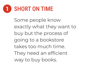
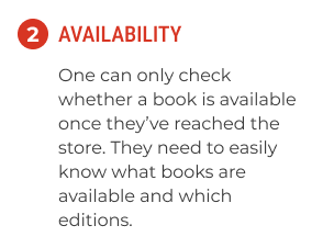
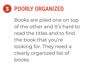
Time is one of the most valuable assets, yet one we cannot buy. For working adults going to bookstores has become increasingly rare with how busy their lives are. Even when they do manage to take time out of their busy work days, when they get there the store may not even have the book they're looking for.
Create an e-commerce app that allows users to search for, check the availability of, buy and get home delivery or in-store pick up of their favorite books.
To ensure I followed a user-centric approach to this project, I followed the steps in the below mentioned design process.
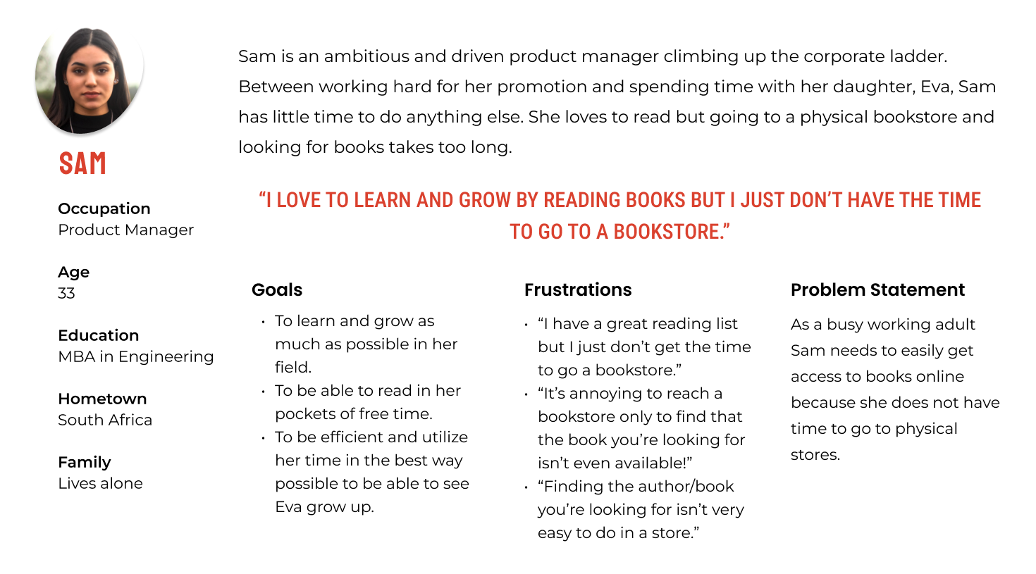
I conducted primary research and secondary research to understand what issues users are currently facing when buying books - offline and online. The target audience for the primary research was working adults – in different stages of their career. I conducted telephonic interviews with 7 people.
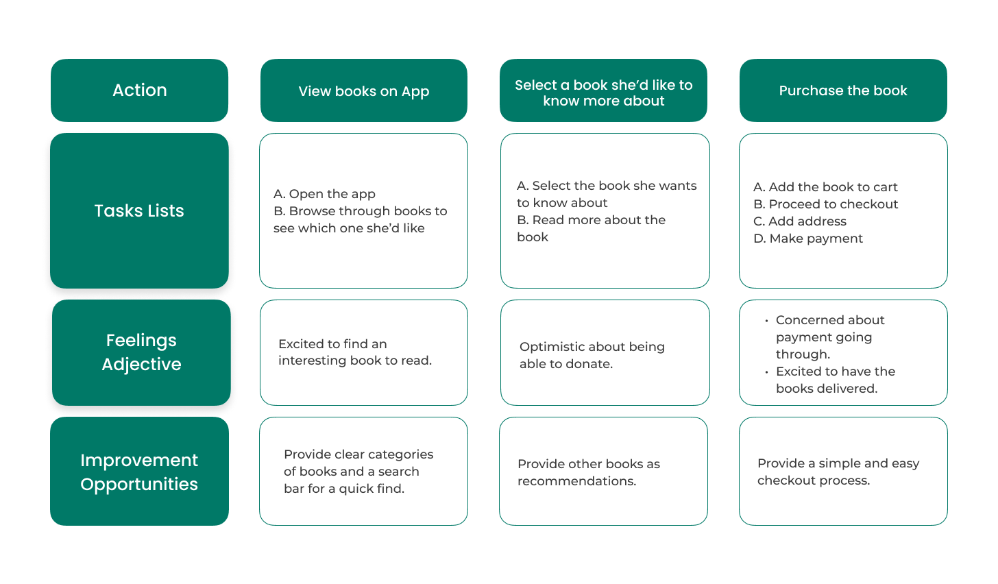
Next, I synthesised my findings to define who my user is, map out their journey and create a site map to help inform my design.
I used a User Journey Map to identify the gaps the users may be currently facing when looking to adopt dogs online.
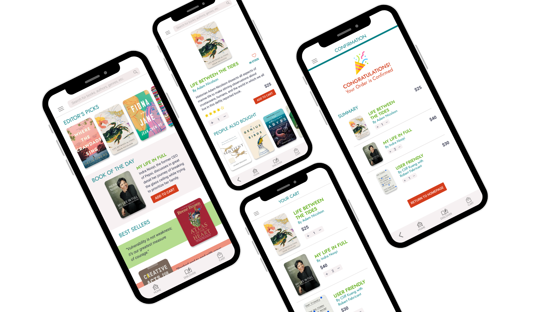
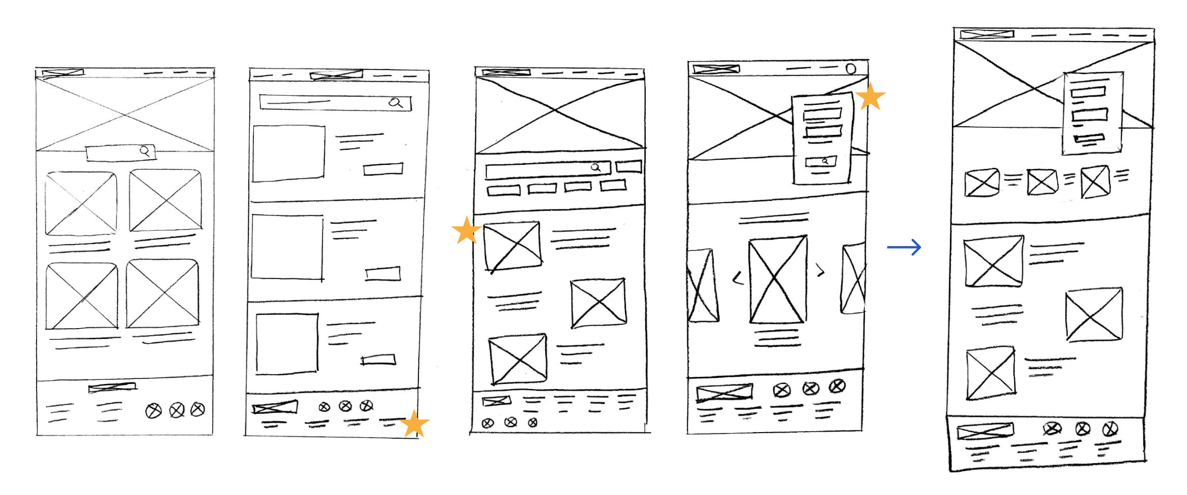
As a first step I drew paper wireframes to ideate the design of the app. Creating multiple versions of the same screen helped me figure out what all the possibilities would be for this page. For the home screen I prioritized easy access to information. Stars were used to identify which features would be most important to take forward.
Taking into consideration the insights gathered from my research, I crafted digital wireframes.
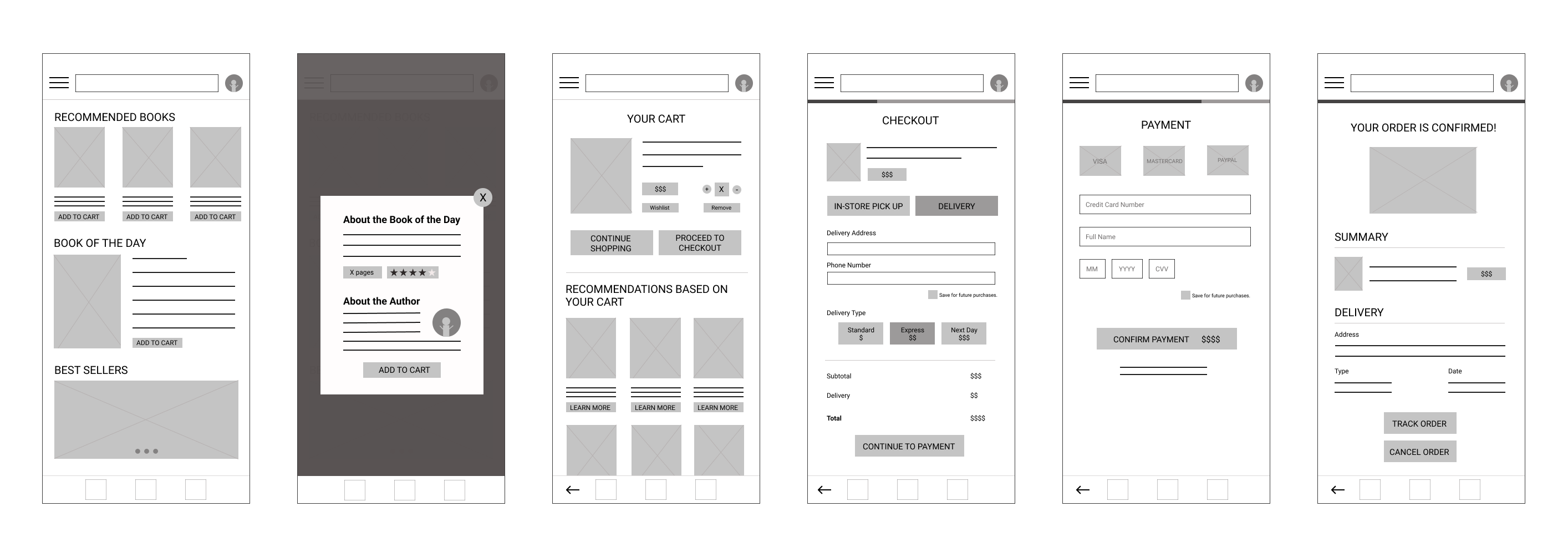
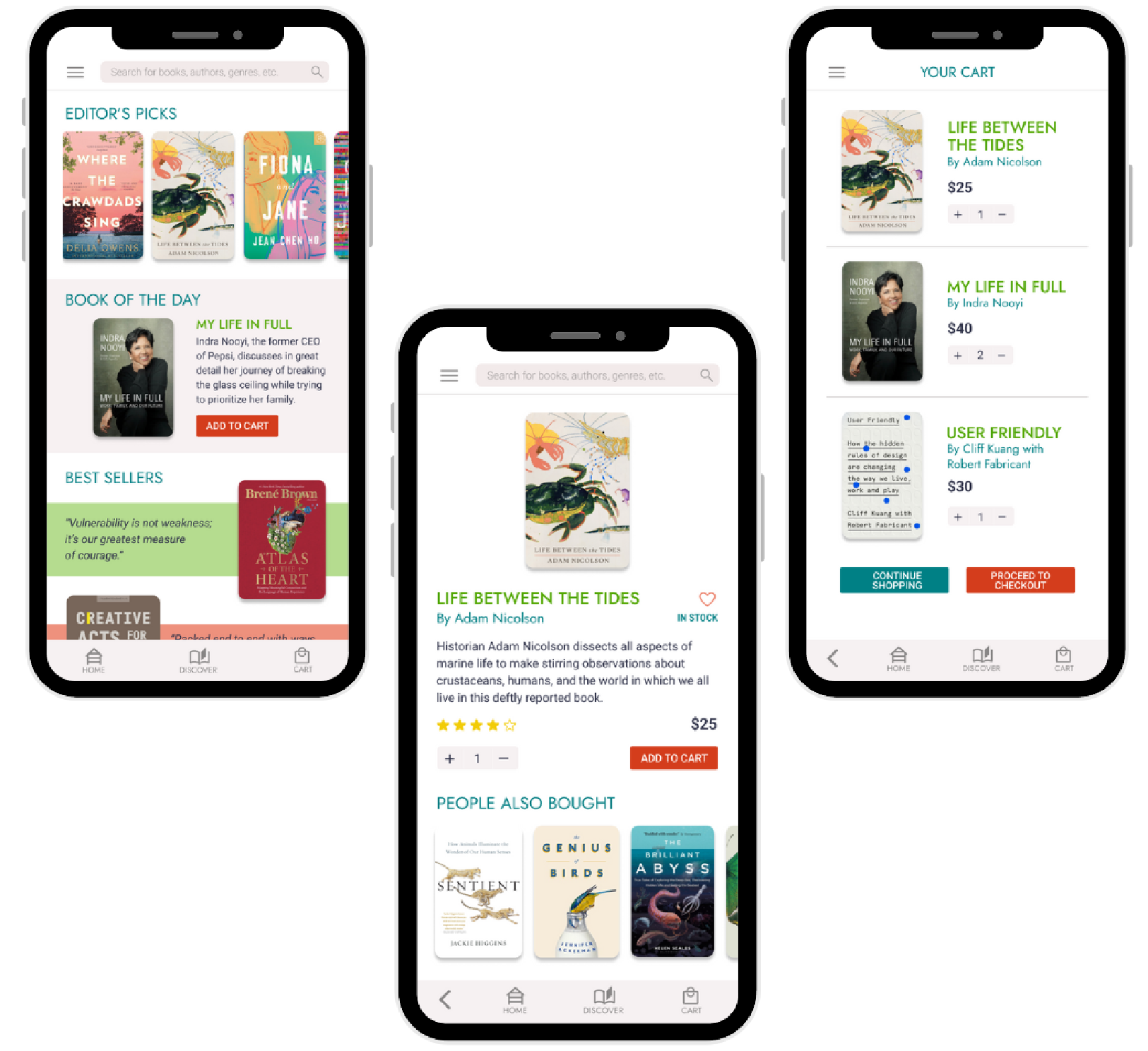
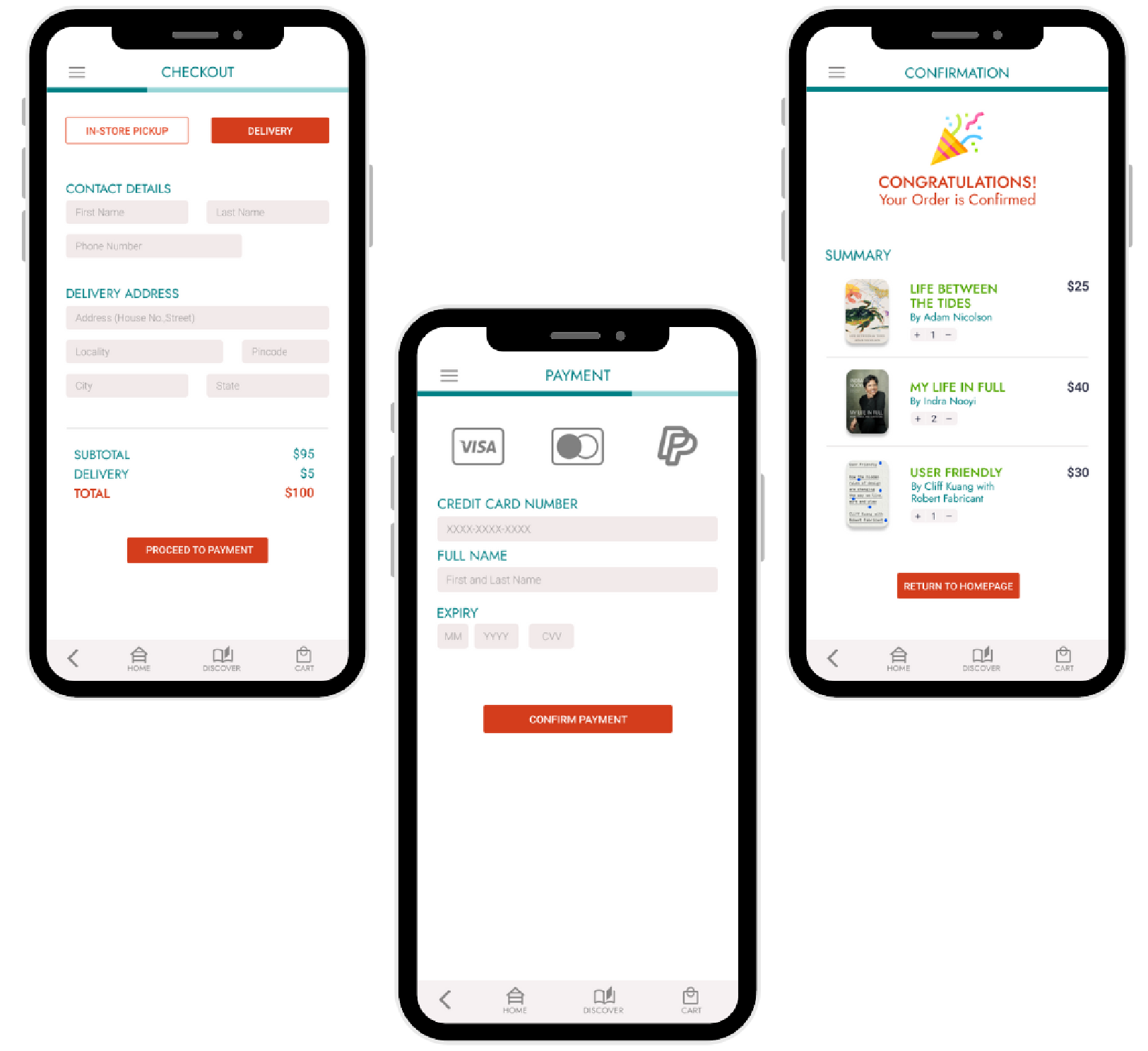
After recreating the wireframes digitally and taking into account the users feedback, I made the necessary changes to the low-fidelity prototype. For example, based on my research, people who visited bookstores found it hard to find a book or find similar books. The search bar and recommended options are meant to help the buyer get to what they need quickly and efficiently. One of the pain points that users repeatedly mentioned was a fast and efficient way to purchase books. The progress bar allows users to see how many steps there are to finish checkout. Also, they wanted the flexibility to either have the books delivered to them or pick it up in-store.
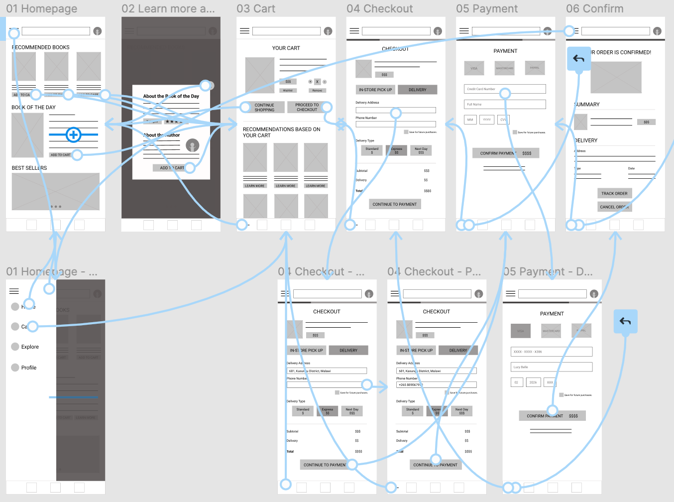
I conducted usability studies remotely with a diverse audience to understand what parts of the app were working and what needed improvement.
I incorporated the above mentioned feedback to improve the final designs of the page. I kept the visual design clean and simple as that's how I would like the process to be. I've kept the navigation on top for easy access and buttons clearly distinguished by color to make it clear.
I learned that one should never assume what the users are thinking as it may be totally different than one's own assumptions. I also see the value in gaining feedback and iterating designs accordingly to help create a more refined product.
I will conduct further interviews to see if the experience has improved for users. These interviews will also help determine what features users may want to see going forward.
“I love this app for its simplicity and aesthetic. It's easy to use!”